top of page
KEEPING IT FRESH
Margaret River Roasting Co. were in need of a fresh approach for packaging their top-notch coffee beans, not only in design, but also in molding their brand strategy and story, and how their brand comes to life holistically, beyond packaging.

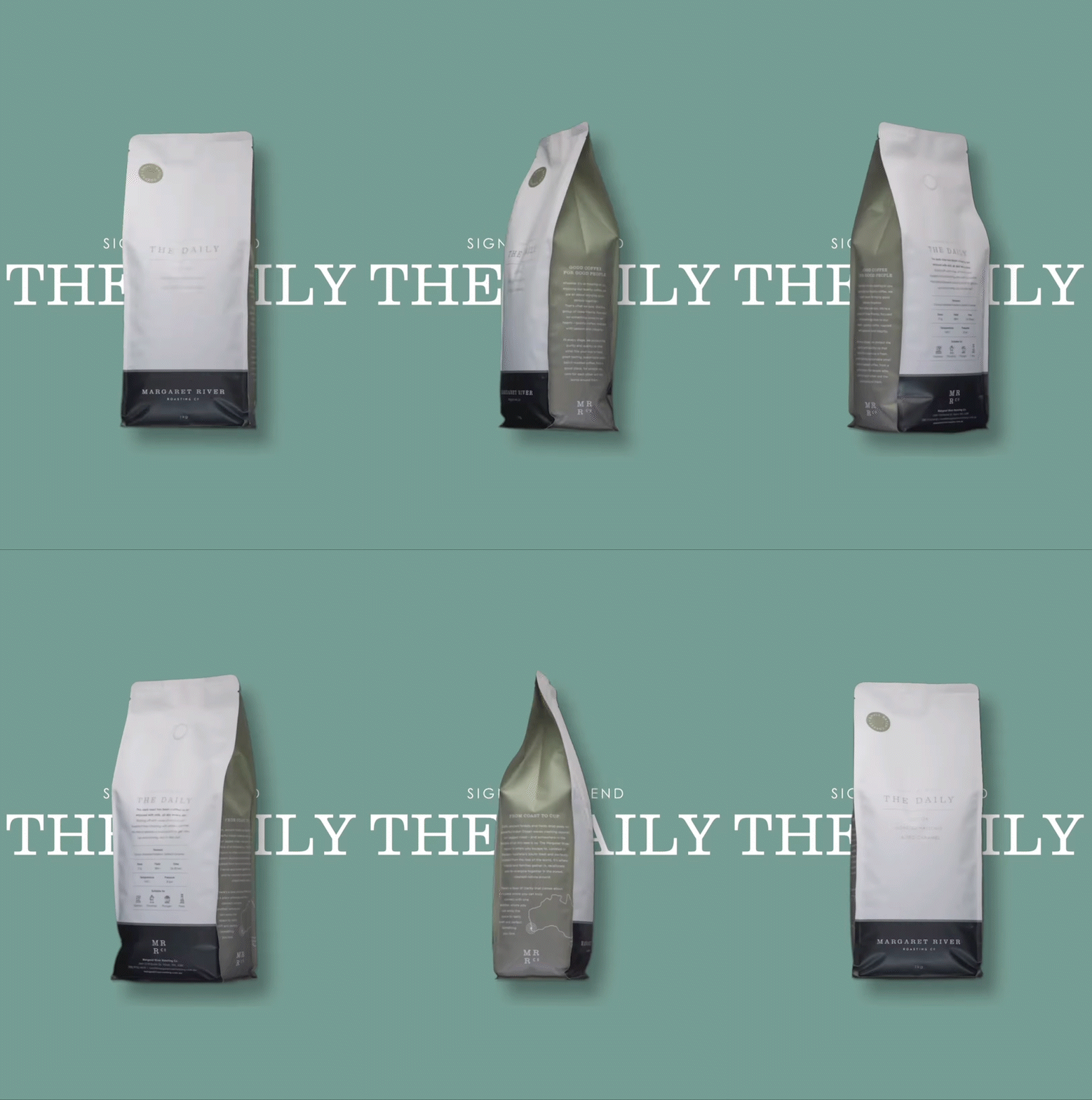
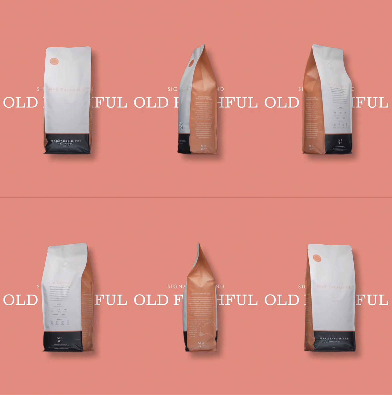
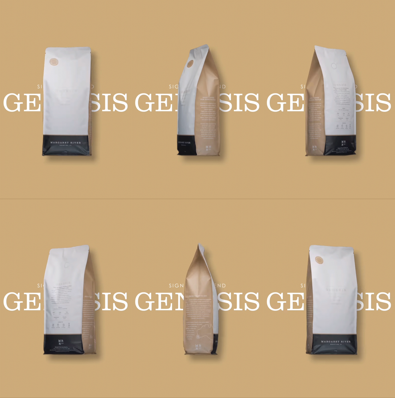
NEW PACKAGING DESIGN FOR SIGNATURE RANGE
COLOUR WITH MEANING
Each variety within the signature range needed its own identifiable colour, with each drawing inspiration from the natural palette of the Margaret River region.


LOGO FLEXIBILITY

As part of the design process, we developed a short-hand secondary logo to be used as a truncated brand sign-off for simplicity and flexibility in certain brand applications.
A STORY BEHIND EVERY BEAN
Margaret River Roasting Co. is not just about the coffee, but about the people who roast it and ultimately drink it. We needed to bring the connections and heart behind the roasts, along with the story behind the iconic region to the fore.

SIDE 1


SIDE 2
BACK


SIGNATURE BLENDS RANGE (250g)


LIMITED EDITION & SINGLE ORIGIN BAGS (250g)
(FOR LABEL USE)


bottom of page


